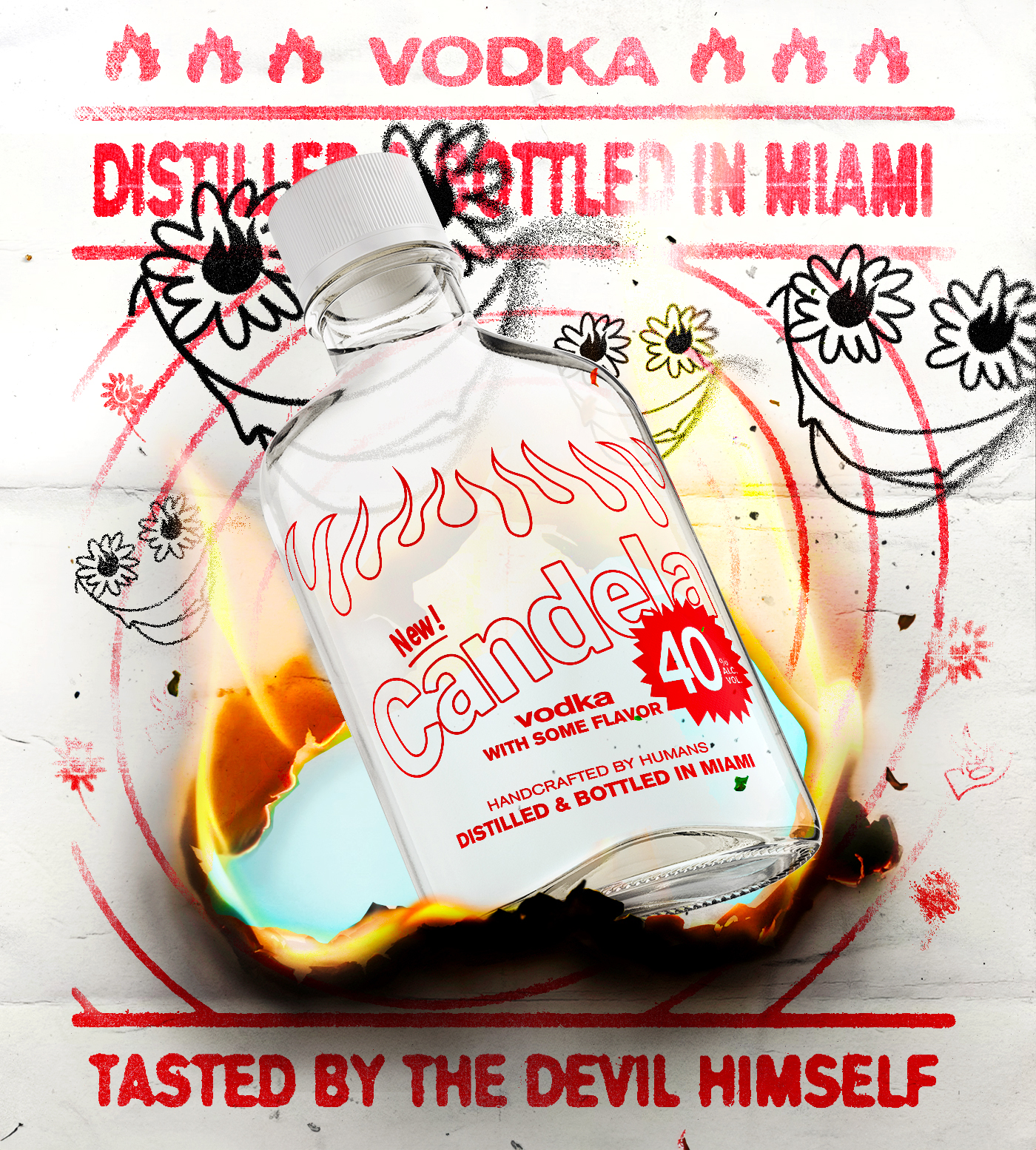
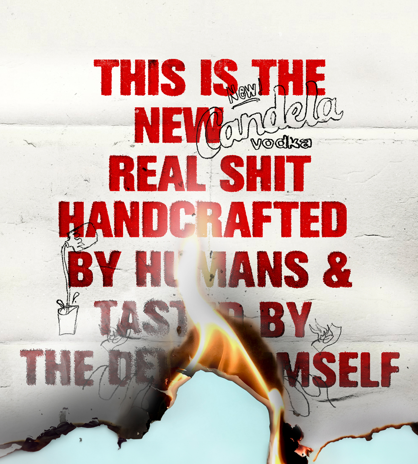
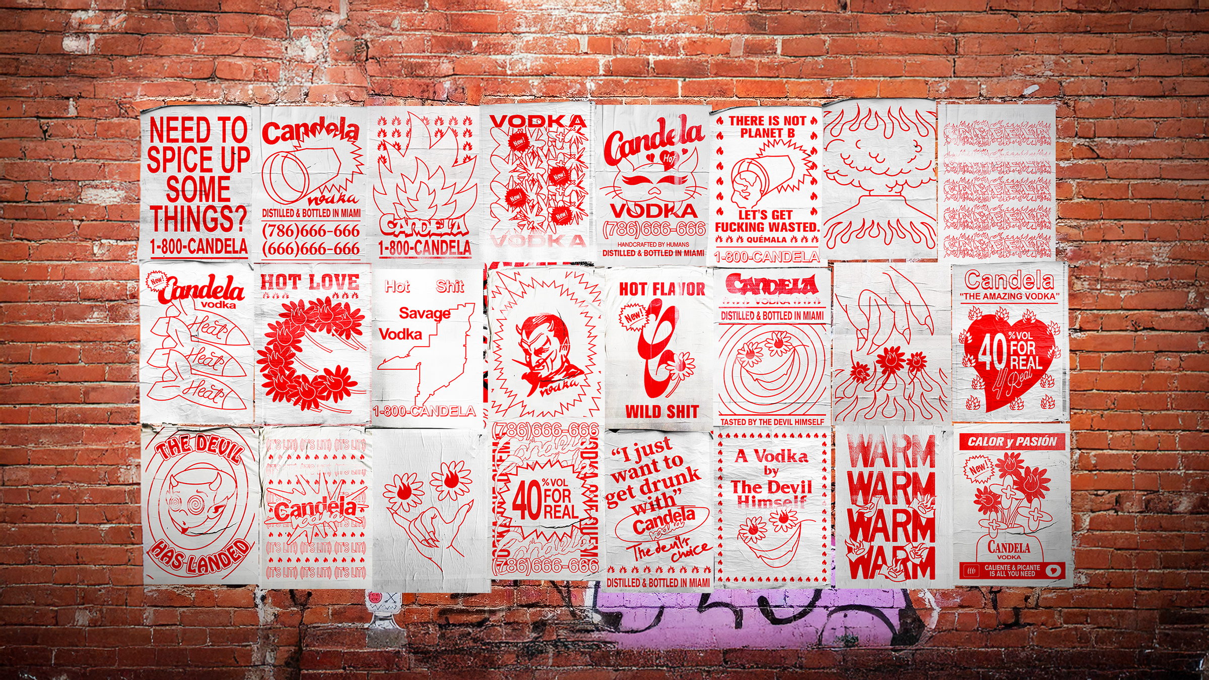
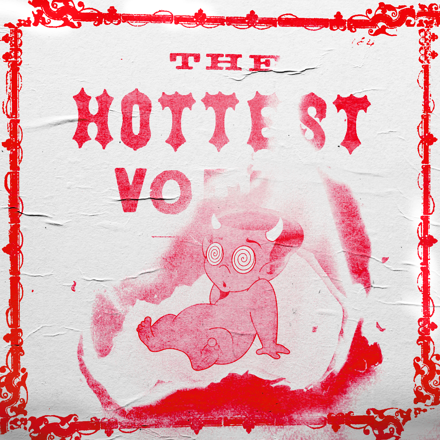
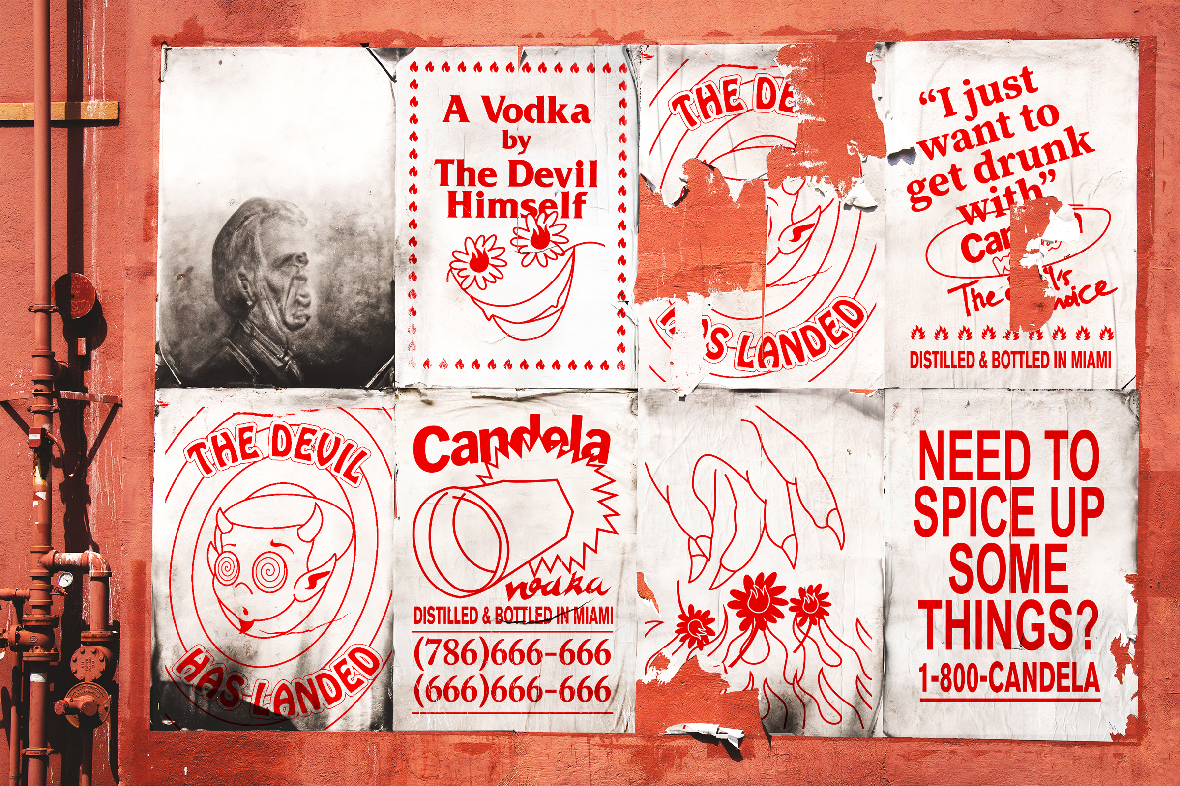
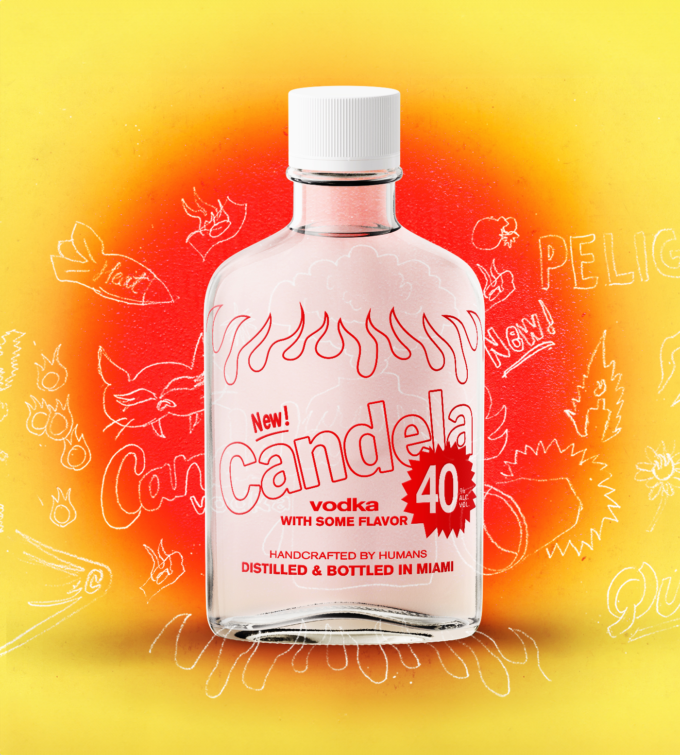
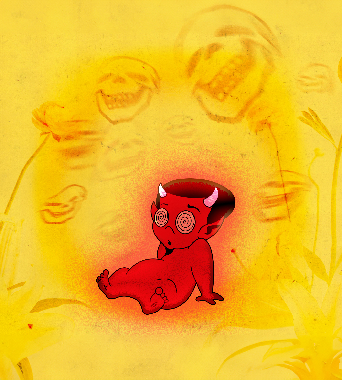
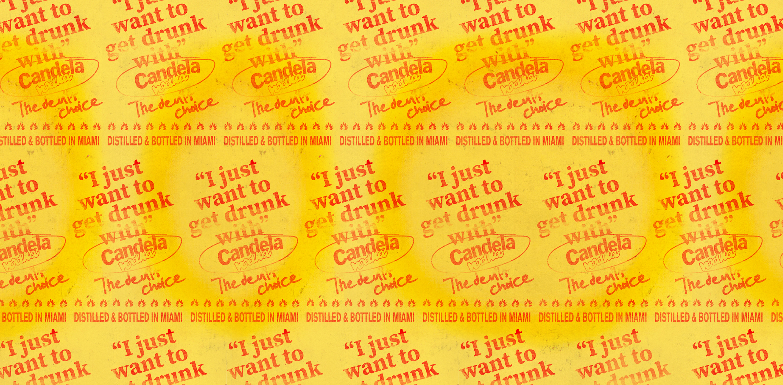
A Visual system of energy & fire
Candela Vodka draws from the intensity and visual culture of Miami, a context defined by heat, contrast and excess. Rather than leaning into traditional "premium" codes, the identity explores fire as a central narrative device to build a more expressive and distinctive presence.
The system is built around sharp, flame-like forms, high-contrast color and distorted typography, creating a visual language that feels tense, energetic and alive. Each element works together to translate the idea of heat into something structured and scalable across applications.
More than a stylistic direction, the project focuses on turning a singular concept into a cohesive identity — one that feels immediate, provocative and unmistakable.